Since we started CHIC, my team and I all agreed on one common thing: Heaböx is not the name we have dreamt about to represent our lunchbox. So after brainstorming a lot to find the perfect brand, we came with this new idea:
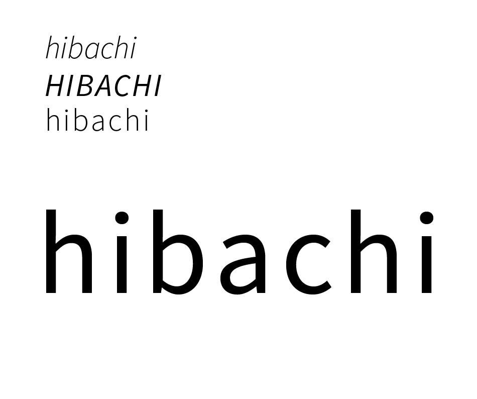
Hibachi
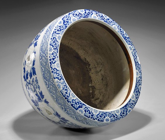
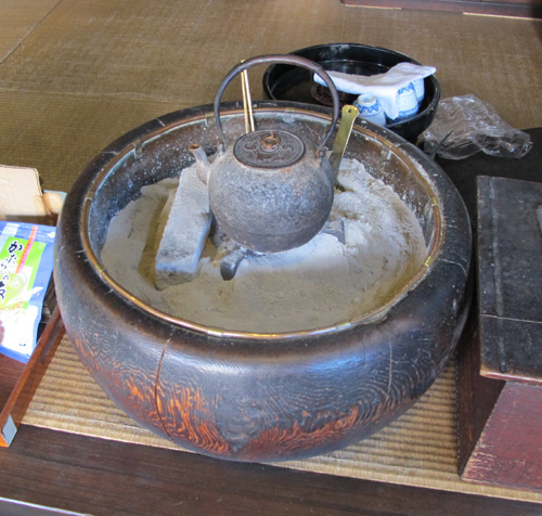
The name hibachi was originated in ancient Japan from the 1860’s. Etymologically comes from hi which mean fire and hachi which means bowl, it’s also called “fire bowl”. It was used as a heating device holding burning charcoal.
The hibachi was once a common sight in Japan before the 40’s but it became a rarity. However, they remain in use in some traditional settings, such as tea ceremony, older stores, and outdoor festivals.
We really liked the meaning and the story about this beautiful object, it fits perfectly to our product and gave us a good basis to build our identity.
Unfortunately we came quite late with this new name, an essential point to design the logo. But this not the first challenge we had to face since the beginning of this adventure and it’s with motivation that I started to iterate on the logotype. The first step was to search the appropriate typeface. I put my choice on the Source Sans Pro that I found efficient, clear and harmonious. I willingly let a lot of space between letters and used lower case to have something really light and fresh. All of these elements express a reflection of style and delicacy: it shows the way, in which people who care, tend to see themselves: healthy, light and without stress.
But now, what graphical representations could we add to give the perfect identity? Quite fast came the idea of the bowl (from “the bowl of fire”). It surrounds many points of our lunchbox like transport, food, and this container is mainly use to drink soup or tea, two meals that are comforting and generally synonym of health. With all these factors, time was to iteration, iteration and iteration, as you can see:

After a lot of trials, we are close to find the final design. We just need to adjust some little details and the identity will be born!
![]()